Monday, December 28, 2009

The link between font and a brand

Over the christmas there are many beer commercials on, but for me this one stood out. It is a heineken ad, where the viewer see's through the eyes of a person going to friends house's and being welcomed in. We know it is an ad, but we are not sure what yet, because they have not shown the heineken logo or anything obvious to suggest what brand it is for.
Then on screen, with a black background, some text appears (that still doesn't mention Heineken) but as soon as I saw this I instantly realised that the ad was for Heineken.No, im not physic, I just recognised the font.
If asked a lot of people might not know what the Heineken font is like, but it is something that we have subconsciously learned over time through advertising and branding.
I just found it really interesting to see first hand how effective and important text and font can be used. It can be used in the most subtle ways, but it is always important to consider that the font used is part of the message, even if we do not realise it.

Thursday, November 26, 2009

Image Assignment


These are four images for a recent assignment. We had to create an image using only photographs (no text and only basic photoshop adjustments) to show the meaning of the following four words: Love, Hate, Strong, Corrupt.
Love:

The concept for this image was the idea that two people want to spend their lives together. I added saturation to really make the couple stand out and be the focus point.

Hate:

The conept here is 'the qualities the people hate within themselves'. The image also represents the pressure teenagers (and girls in particular) feel.

Strong:

The concept is the feeling strong, and that people are strong when they are united and in a community. The image is of the public sector on strike.

Corrupt:

The idea here is that the banks are corrupt and that they have brought on this recession and that they have put this homeless person to the streets. He also represents all the people that have been done wrong by the banks. The bank looks big and strong and in contrast is the man below.

Any questions/comments welcome!
:)

Sunday, November 8, 2009

I had an assignment for Visual Communications to create an image that depicts each of the words below. No photo's were allowed so it was created entirely in photoshop. The idea behind the assignment was to try and get into the meaning of each word. Here's each of them..
Cold

Hot

Dark

Bright

Wednesday, October 21, 2009

Helvetica...?


Firstly i think its funny that you cant use Helvetica on Blogger.com!

I never really knew that much about Helvetica, and it was interesting to see in the documentary how widely used it is.
To be honest i was never really that into choosing fonts. I would just highlight my text and go through all the fonts to see what looks good. ignorant perhaps, but in my defense im not a graphic design person really. Now I think I'm in danger of using Helvetica for everything! So I'll have to make sure I don't.
I was surprised at the level of detail and precision in design also when designing a font.
I think the biggest testament to Helvetica is how it is still so widely used even after 50 years.

In the documentary they showed a lot of logo's and signs that use Helvetica, so I started to open my eyes more when i was out to fonts etc. The other night at the cinema I saw what was probably one of the worst signs I have ever seen. It was a homemade sign for Thorntons chocolate 2 for 1 offer i think. Now the logo from Thortons looks like this...
Only problem was the rest of the sign was written in this font too. AND the sign was around 5 or 6 foot behind the counter. so chances of anyone reading it or bothering to try and read something so illegible is very slim. I just wonder what person is lacking common sense so much that they would do something like this!
Moving on....I found this fun little flash 'game' i suppose. Any people interested in font might enjoy it! (you can control the Helvetica letters)

Sunday, October 11, 2009

Zombieland Intro Sequence

Well im just back from the cinema after seeing Zombieland. And well, its really really good (...really).
But what i particularly liked from a media point of view, was the intro sequence. The text and titles are well integrated with the video. Lots of effects like blood splattering on the text, falling text and people knocking text over etc. There's lots of different effects in the movie too, lots of blood etc but its a comedy really!
Should be of interest to people interested in video especially!


Definitely recommend it!


Friday, October 2, 2009

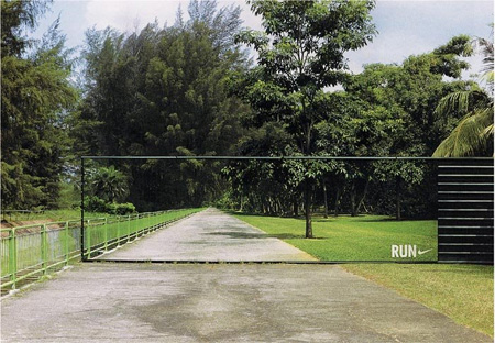
Clever Advertising

Just wanted to post this. I really like ads like this that interact with the environment around them. They really help the ads stand out and can often because famous locally and talked about. Most of all they are just something different to the regular ad's that we are bombarded with. It could be very expensive but for big companies this wouldnt be a huge problem.